Hiring analytics
KPIs, charts, and trends for everything that matters in hiring — total jobs, drafts sitting too long, time-to-publish, status mix, department breakdown, and a 30-day created-vs-published timeseries.
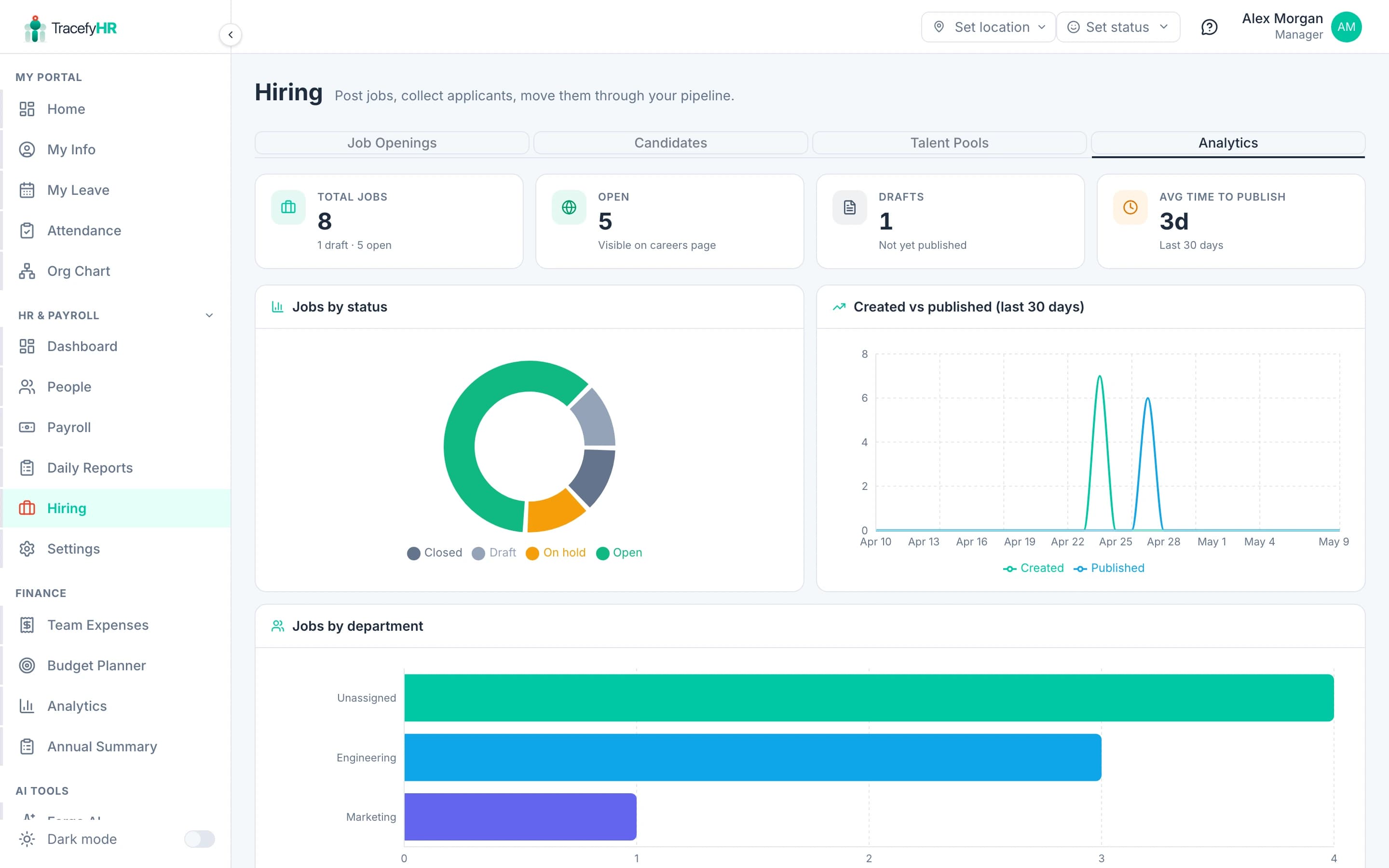
The Hiring → Analytics tab gives you a single-screen rollup of how your hiring is actually going. It refreshes the moment any job is created, published, or closed.
The four KPI cards
The strip across the top:
- Total jobs — every job ever created on this tenant, regardless of status. The helper text below shows how many are draft and how many are open.
- Open — the count of jobs visible on your careers page right now. This is the number you watch when planning a hiring sprint.
- Drafts — jobs created but never published. A growing draft count is a "draft fatigue" signal — it means people are starting jobs and abandoning them.
- Avg time to publish — the mean days between
createdAtandpublishedAtfor jobs that did publish in the last 30 days. Two days is normal. Two weeks means your team is sitting on drafts.
The four charts
Jobs by status
A donut showing the split between Draft / Open / On hold / Closed. Colours match the status pill colours in the Job Openings table — same coding everywhere, so a glance at the donut tells you what your dashboard pills say in aggregate.
Created vs published (last 30 days)
A line chart with two series — created (teal) and published (sky blue) — over the last 30 days. The shape of the gap between the two lines tells you how long jobs sit as drafts before going live. A consistent gap is fine; a widening gap is the same draft-fatigue signal as above.
Jobs by department
Horizontal bar chart of how many jobs are open per department. Top 10 departments shown, with everything else rolled into "Other". Useful for confirming hiring is happening where you expect — if Engineering has 8 open reqs and Marketing has 0, you have a funnel-balance question to ask.
By employment type / By work mode
Two paired bar charts: full-time vs contract vs part-time, and remote vs hybrid vs onsite. These won't move much month-to-month; they're for sanity checks ("yes, we're still mostly hiring full-time").
What's not here yet (Phase 4)
The card titled Candidate funnel at the bottom is a placeholder. It lights up when the public apply form ships in Phase 4 and applications start producing real JobApplication rows. The metrics it'll add:
- Total applications — across all open jobs.
- Funnel — how many candidates make it from Applied → Phone Screen → Interview → Offer → Hired.
- Time to hire — mean days from
appliedAttoHiredstage. - Source attribution — Careers Page vs Indeed vs LinkedIn vs Referral.
- Conversion per stage — the rate at which candidates move forward, per stage.
The same endpoint serves both today's job-side metrics and tomorrow's application-side metrics, so when Phase 4 ships, this tab fills in automatically — no migration on your side.
Reading the numbers honestly. If "Avg time to publish" is climbing, the bottleneck is rarely the wizard — it's the team waiting to align on a description. Use a Slack thread for that, not a draft sitting open for two weeks.
Related
- Posting a job — keeping drafts moving
- Candidate pipeline and pools — what feeds the funnel
- Analytics and Reports — for company-wide HR analytics outside of hiring
Last updated 2026-05-09