Analytics and reports
Charts, trends, and the annual summary — TracefyHR turns payroll, expense, and revenue data into board-ready reports without a spreadsheet.
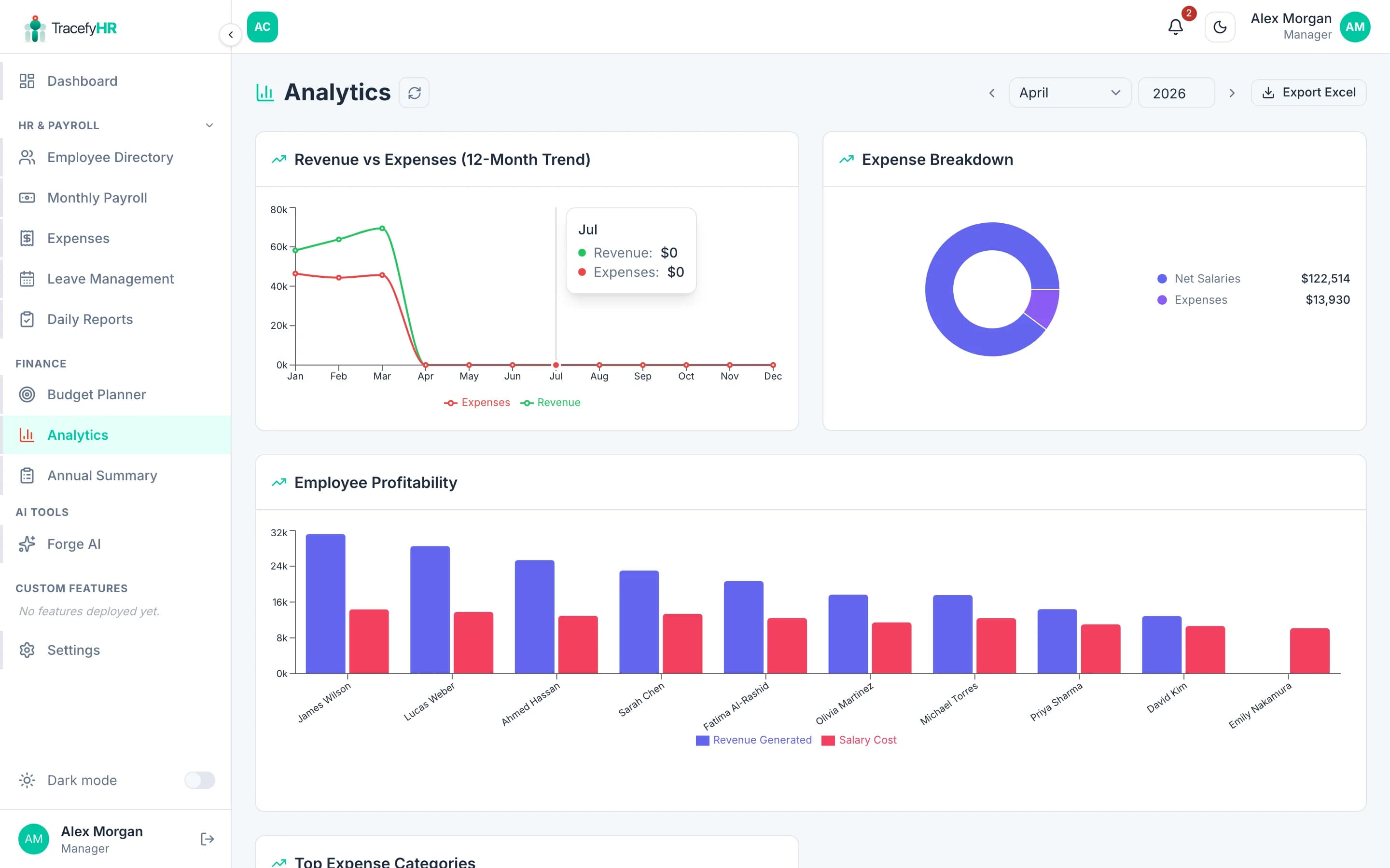
The Analytics page turns your raw payroll, expense, and revenue data into four charts you can read at a glance. The Annual Summary then rolls everything up by year for board-level reporting.
The four charts
1. Revenue vs Expenses
A 12-month line chart showing total revenue (from payroll's Revenue Generated) overlaid with total expenses (approved expenses + payroll deductions). The crossover points tell you immediately when you went red or black.
2. Expense Breakdown
A pie chart split by category. Hover to see exact amounts and percentages. Useful for spotting where money's actually going.
3. Employee Profitability
A horizontal bar chart, one bar per employee:
- 🟢 Green bar — revenue they generated this period
- 🔴 Red bar — total cost (salary + bonuses + their share of expenses)
The chart is full-width and scrolls horizontally for companies with many employees. Sort by net contribution to see your most and least profitable seats.
Profitability is only as accurate as your input data. If you don't track Revenue Generated per employee in payroll, the green bars will all be zero.
4. Top Expense Categories
A horizontal bar chart of your highest-spend categories. Quickly answers "where do I cut?".
Date range
The picker at the top controls all four charts at once:
- This month
- Last month
- This quarter
- This year (default)
- Custom range
Charts update instantly — no save button.
Annual Summary
A separate page (Insights → Annual Summary) that rolls 12 months into one table:
| Column | What it shows |
|---|---|
| Month | Jan to Dec |
| Revenue | Total revenue generated |
| Expenses | Total expenses + deductions |
| Net Profit | Revenue − expenses |
| Profit Margin | Net profit ÷ revenue |
Plus a totals row at the bottom and Export to Excel / PDF buttons.
Common questions
Why does my revenue show as zero? You're probably not entering Revenue Generated in monthly payroll. Open Money → Payroll, edit a finalised month (or the current month), and fill in revenue per employee. The analytics will populate immediately.
Can I share a chart externally? Right-click any chart → Save image as... to download a PNG. Or use the export options on Annual Summary for a full PDF report.
Charts are slow on mobile. We've optimised them, but companies with very long histories (3+ years of monthly data) may take a beat to render the trend chart. Use the date range picker to limit the window.
Can HR see analytics?
Only if you've granted them canAccessFinance. See Managing permissions.
Related
Last updated 2026-05-05